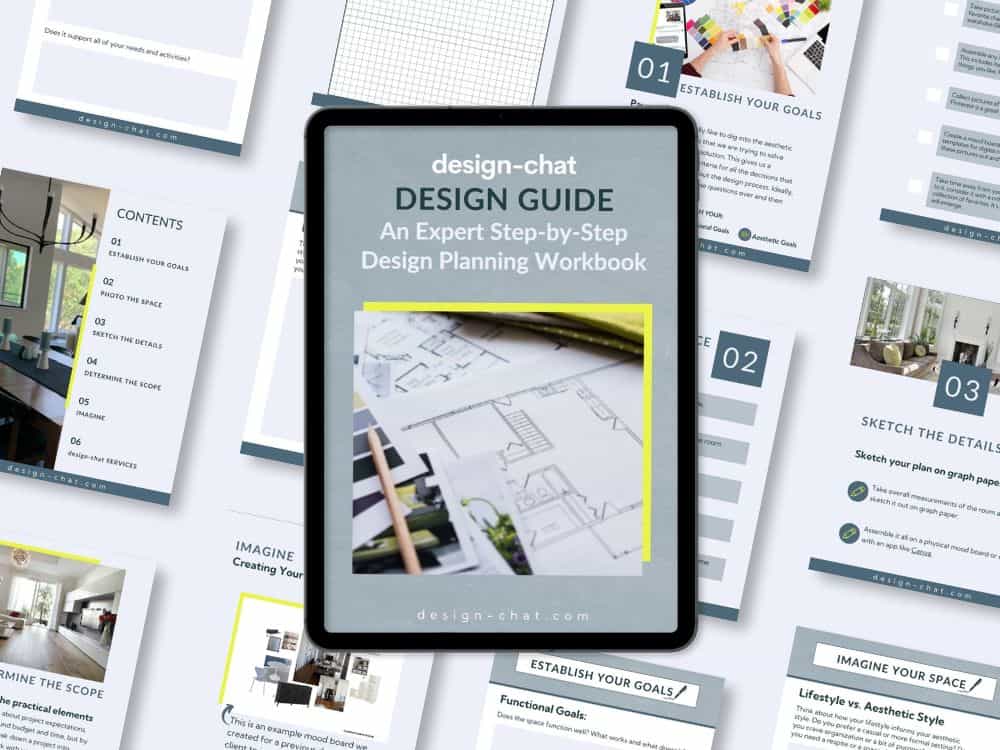
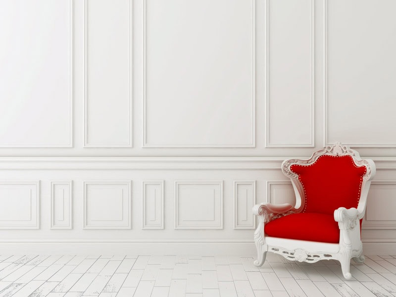
Discover how to use the elements of design like space and color to master the design principles of balance, scale, harmony, rhythm, emphasis, contrast, and details. Approach your project like a design professional and take your home design to the next level!
Whether you’re a DIY design novice or a seasoned guru, understanding the fundamental Principles and Elements of interior design that professional designers use in guiding their design decisions will help you elevate your design solutions.
First let’s start with the basics. The interior design principles are the overarching guidelines that we use to create functional and visually appealing spaces, and the interior design elements are the tools that we use to achieve those goals.
The 7 Principles of Interior Design
- Balance
- Scale
- Harmony
- Rhythm
- Emphasis
- Contrast
- Details
The 7 Elements of Interior Design
- Space
- Color
- Light
- Line
- Form
- Texture
- Pattern
An understanding of these design fundamentals simplifies the design process by providing an objective framework for making design decisions.
For example, in a living room with a fireplace that is not centered in the space and is throwing off the overall visual balance of the room, you may use the form and lines of the furniture to offset the visual weight of the fireplace and create balance.
Balance is a principle of design; form and line are the tools used to meet that end.
Regardless of where you are on your personal DIY design journey, an understanding of these basic concepts will give you the confidence to make thoughtful decisions that will transform your home to reflect your unique design-style and life-style.
Understanding the 7 Principles of Interior Design
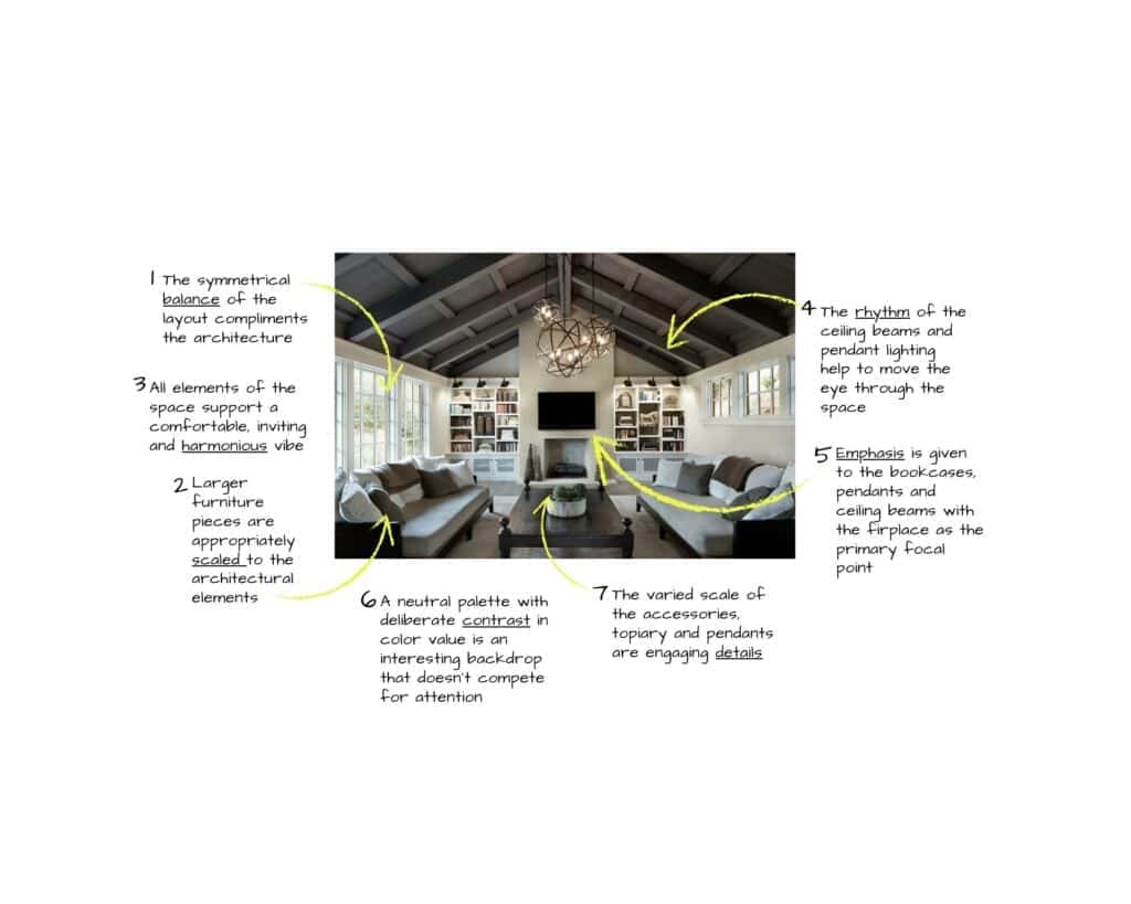
1. Balance
The most fundamental of the design principles, balance, is about creating visual equilibrium within a space.
To achieve balance, a designer will consider the overall volume of the space, how that shell relates to architectural elements (doors, windows, fixtures, built-ins), and then how the layout of furniture and accessories works with those elements. A well-balanced space will be both visually pleasing and create a sense of visual harmony.
The principle of balance is also useful when considering a piece of furniture and how the overall dimensions relate to its form.
2. Scale
The consideration of the proportions of an overall space as well as the proportions of individual elements in the space and how they relate to each other. When considering scale and proportion, we also think about how they relate to the human scale.
3. Harmony
Referring to a purposeful cohesiveness of the style or mood of a room where all elements complement each other and work to support the aesthetic and functional goals.
4. Rhythm
Like in music, rhythm is an about creating a sense of movement in a space and can be achieved by adjusting the layout of furniture and objects or the purposeful use of color, patterns and lines. Rhythm will help to guide the eye through the space and create a sense of flow.
5. Emphasis
The purposeful creation of a main focal point and secondary focal points in a space will help to create visual balance and guide the eye through the room.
6. Contrast
Deliberate use of items that are not in harmony help to create a dynamic and visually interesting environment. Contrasting styles, colors, patterns or even scale can all be used to purposefully dial up the energy of a space.
7. Details
Ensure that every element of the space is contemplated and deliberate, from knobs to baubles and even scents and sounds.
Understanding the 7 Elements of Interior Design
Once you understand the basic principles, you can learn how to use the elements of design or the “design tools” to manipulate our perception of the built environment. That’s when things get creative and fun — remember design is just lovely problem solving.
Keep in mind that while each of the elements of design is interesting in solo, it’s how you combine them that creates a unique and memorable space. As you make design decisions, keep assessing whether each decision supports or detracts from the aesthetic and functional goals for your space.
1. Space
Space refers to the physical area of a room, its overall proportions, dimensions, and volume.
When we consider space, we are assessing the relationships between the layout of the room and fixed architectural elements (windows, doors, built-in millwork, fireplaces etc). If we’re lucky, the shell of the space feels visually balanced, and by that, we mean that the overall volume and relationship of the architectural elements are thoughtful and create a feeling of harmony.
Unfortunately, not all architectural shells are harmonious — we’ve all been faced with strangely located doors, bad window proportions, and built-in elements like bookcases and fireplaces that aren’t appropriately scaled for the volume of the space. In a perfect world, we would just knock down a wall, move a door, or replace the built-ins. But in the real world, it’s not always practical or feasible to make these major changes.
Fortunately, as designers, we have an assortment of tools we can use to improve the balance of an architectural shell.
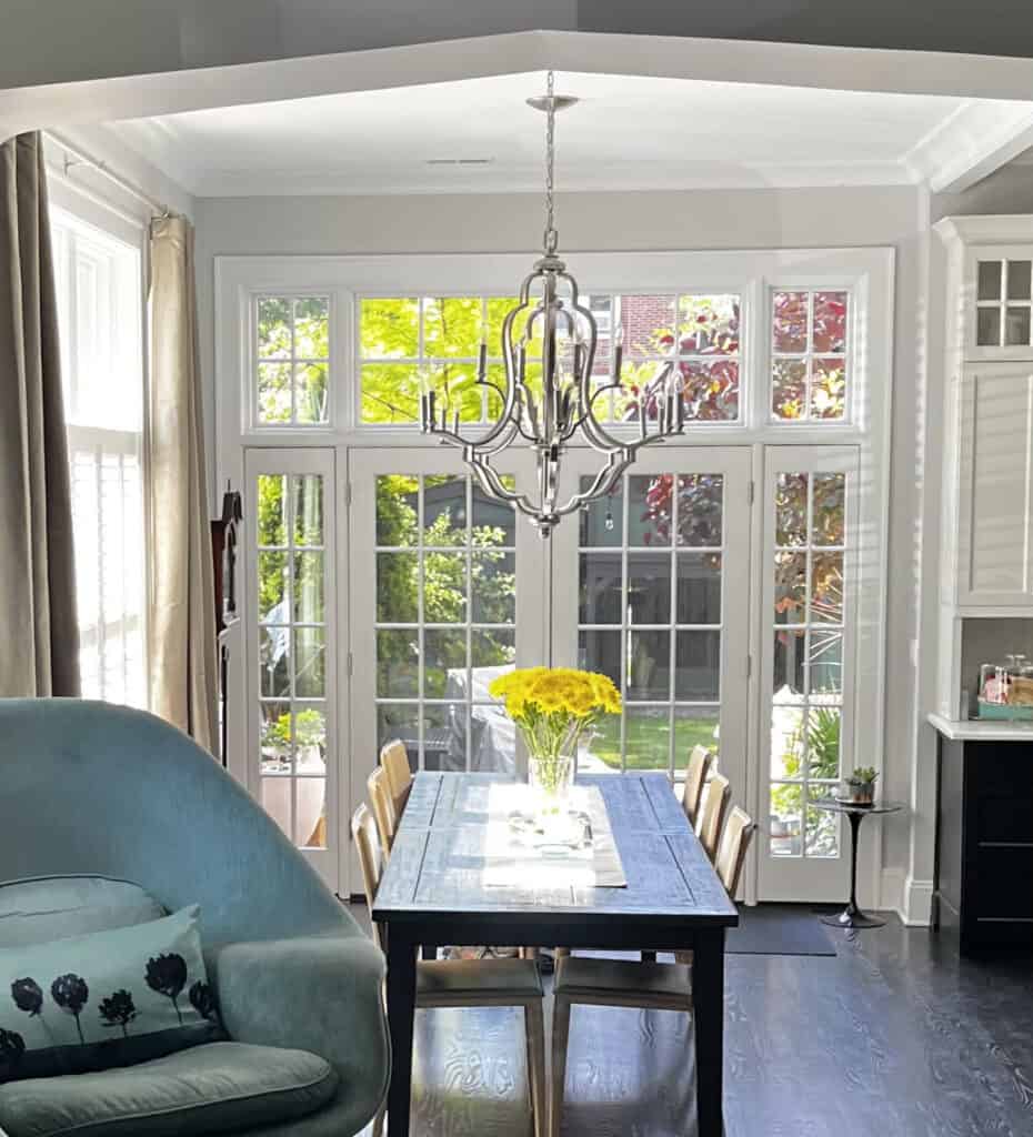
One of the most powerful parts of the design is the layout of the space as it will drive how we use and interact with a room and it will set the tone for the atmosphere of the space. Establishing the layout is a good starting point for every project.
When we’re considering the layout, we think about the different functional requirements of the room, the different ways we use the space, how we circulate through it, and how it relates to the rest of the home. We also need to consider how we want the room to feel, as the layout will be the first step in creating a casual or formal vibe. On a broader scale, we are thinking about the visual balance in the space, that is, how the fixed architectural elements relate to each other and how we can use furniture and accessories to create a sense of proportion and balance.
A good starting point for developing a balanced layout is to determine the focal point in the room, that is, an object or zone that you want the eye to be drawn to first. The main focal point may be an architectural element like a fireplace, a seating zone, or a wonderful piece of artwork. Once you’ve established the focal point, you can start to think about how other elements can be positioned to support the functional requirements and aesthetic goals.
As you further develop the layout, consider the scale of the furniture, rugs, and accessories and how they relate to the volume of the room and the architectural details.
Keep in mind the importance of negative space (empty areas around and between furniture) with the goal of enforcing the main focal point and giving the eye other interesting secondary points to rest on.
Types of Balance in Interior Design
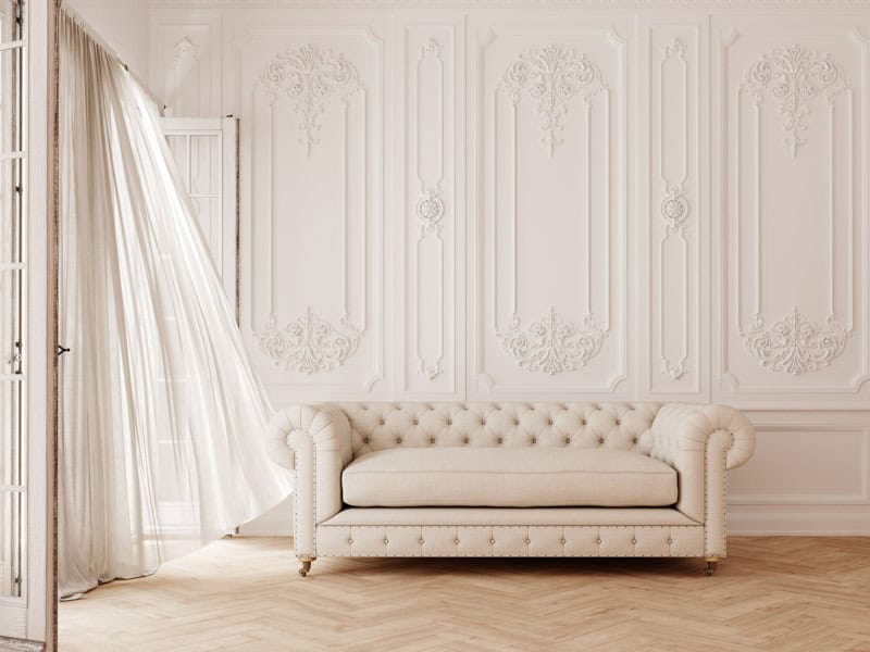
- Symmetrical Balance – Typically found in classical architecture and traditional interiors, symmetrical layouts usually focus on the center of the room and, in the strictest examples, mirror the layout of the furniture and accessories from one side of the space to the other (think oval office and all palace interiors).
Mixing a symmetrical layout with casual furniture styles results in a more contemporary vibe but with the calmness of symmetry. - Asymmetrical Balance – A common approach with contemporary spaces, asymmetrical layouts are a bit trickier as you are mixing items with different visual weights on each side of a room but still aiming to create a sense of balance — when it’s done right, the result can be quite dynamic (the modernists mastered this trick — see Corbusier).
Open plan spaces are an extreme example of asymmetrical balance as we’re not just creating visual balance in each zone but also balance between the different zones in the room. - Radial Balance – This involves arranging elements around a central point a room and allowing all elements to radiate from that point — a good examples is a round dining table surrounded by evenly placed chairs.
Although radial symmetry is typically associated with a formal vibe, it’s easy to imagine how placing an assortment of chair styles and sizes around a round dining table would create a more casual feeling.
✏️ Design Tip
When you’re thinking about the layout of a space it’s great to draw the room to scale on gridded paper and then create to-scale cutouts of the furniture and play with them on the plan. It’s an easy exercise that quickly helps you to understand the concept of creating balance in a space plan.
✏️ Design Tip
Good Design doesn’t always mean following the rules. Sometimes throwing off the balance can be a way to create some interesting energy in the room — like adding a blatantly over-sized piece of furniture to a smaller space, which can create a sense of luxury, drama, or whimsey…if it’s done right.
2. Color
Color (or “colour” if you prefer the more traditional spelling) is the quality of an object resulting from light being reflected or emitted by the object.
In interior design, we refer to a project’s “color palette,” and by that, we mean the color of every object (furniture, fixtures, artwork, accessories) and every finish (paint, wall-covering, flooring) in the space.
We could write a tome on color!
It may be the most powerful and yet, destructive tool that a designer has as it can perfectly support or even elevate a space or completely and utterly destroy/undermine an otherwise well-designed room.
Color can transform the mood and atmosphere of a space, influence behavior and even provoke physiological responses. (Fun fact: the color of a room can actually effect a persons perception the temperature!) Understanding the basics of color theory, which is how colors work together and how they can affect our perceptions, moods, and emotions, empowers designers to create purposeful palettes that convey specific responses.
Historic color trends can also affect our perception of color. The overuse of “mauve” in the 1980s resulted in that entire range of muted pinks being unpopular for decades, and they are just now being embraced again. Designers need to be tuned into current and historic trends to ensure that if they are creating palettes that strongly reflect historic or current color trends, that they are doing so deliberately and are comfortable with a palette that will be less timeless.
On the most basic level — warm colors (red, yellow, orange) are often associated with feelings of energy, warmth, and comfort, while cooler colors (blue, green, violet) tend to be associated with nature and convey a sense of calm and serenity. A palette made up of colors that are close together on the color wheel, like blue and green, will feel calmer than a palette based on opposites, like red and green.
It’s empowering to think of colors in terms of how they affect perception. The good news is that most people that love design are very tuned to color and already have an innate understanding of basic color theory. Creating a palette can be daunting but it can also be the most fun part of the process, if you break it down into a series of objective decisions.
- Determine the functional and aesthetic goals for the room.
Example: Create a warm, cozy, and inviting environment for lounging with family. - Make a list of all the colors in the space that will not change.
Example: Off-white sofa, blue-grey tile floor, honey-oak doors and trim. - Photo all of these individual items.
Or better yet, assemble a small sample of each item like sofa upholstery, small tile sample, wood sample, etc. - Assess the items in the existing palette — are they supporting the goals for the new design?
Example: In this case, blue stone flooring is perceived as hard and cold and doesn’t support the goal to create a warm and cozy space. - Consider the items that can be changed in the space or new items that can be added.
Example: Start with the items that will have the greatest impact on achieving your goals — in this case, adding a large warm-colored rug to minimize the effects of the cold-colored tile will be an obvious first step.
Next, think about other big moves that can contribute to the cozy goal — like a warm paint color or additional furniture items in warmer colors. Once the bigger moves are all working together, think about the accessories and how they can further contribute to a cozy/relaxing palette.
Once you have a general idea of the components of the color palette you can think about the other design tools (scale, line, form, texture, pattern) and how they will inform the selection of each item.
✏️ Design Tip
Don’t forget to deliberately consider white in your palette — just like negative space on a plan, white gives the eye a place to rest and creates a clean contrast for every other color in the palette.
✏️ Design Tip
When making a color decision, always get the largest sample that you can, place it in the room where it will be located and look at it in natural light, artificial light and in combination throughout the day. If you’re planning to change the lighting, them make sure to also check the colors in the palette under the new lighting conditions.
3. Light
The light in a space is the illumination that comes from a window or a light fixture in the form of direct, indirect, or reflected light. It includes both the natural daylight a room receives and the artificial light from ambient or accent fixtures.
Lighting deserves more attention as when it’s done thoughtfully, it not only meets all of the functional requirements but can also elevate the mood of a space and add depth and interest to the color palette. We’ve all been in overly bright spaces that are overwhelming to the senses, as well as spaces that are under-lit and don’t meet the basic functional requirements. To strike the perfect balance, we need to first understand how the natural light affects the space and how it changes throughout the day and the seasons.
When considering a light solution, it’s helpful to become very attuned to the natural light that the room receives and to consider that in the context of your design goals. A window treatment that allows you to adjust the natural light, like blinds or drapery, might be the best option when you have a space with constantly changing light levels. They also have the added benefit of helping to control the physical temperature in a room or to protect furniture and finishes from sun damage and fading.
Once we have the natural light working for us, we think about the artificial light in the room. Artificial light sources include the overall light from ceiling fixtures or wall sconces, table and floor lamps that help to create zones of light, as well as light for specific tasks and accent lighting that will contribute to the overall mood of a space and emphasize the focal points in a room.
Artificial lighting options are endless and are the tool that lets us dial the energy of a room up or down depending on the activity and desired atmosphere. Designers like to consider lighting fixtures like a “kit of parts” that we can use differently depending on the desired effects. Dramatic accent lighting combined with wall sconces might create the perfect vibe for evening entertaining, but those same sconces combined with a few table and floor lamps will create a more casual feel for family time. Also note that reflected light, which bounces light off of walls and ceilings, tends to feel more comfortable than direct light.
When making final choices, also keep in mind that the temperature of the bulb is important, warm or soft white bulbs tend to feel most comfortable in our homes but cooler tones described as “natural” light can add a crisp brightness to a space and may also be preferred for specific tasks.
✏️ Design Tip
To better understand light temperature, purchase a range of bulbs that include cool white, natural light, soft white, and warm white temperatures and test them in an existing fixture, ideally without a shade (the color of the shade will also affect the color of the light) and in a zone that isn’t receiving any other natural or artificial light. Look at the color palette under these different light temperatures and note how the light temperature affects the color and the texture.
4. Line
Lines are the horizontal, vertical, diagonal and curved lines of the architecture, furniture, fixtures and accessories. They have a powerful impact on how we perceive a space and are a very useful tool.
In the context of the architectural volume of a space, vertical lines have the potential to make a room feel taller, whereas horizontal lines could make a space feel wider.
For instance, if you have a room where the ceiling height feels proportionally low, adding the horizontal line of a chair rail will enforce that negative perception of a low ceiling. Conversely, integrating a vertical line, like a vertical paneling or wallpaper with a vertical stripe, could help (if done properly) to create the sense that the ceiling is higher and better proportioned to the space.
Similarly, if you have a room that is excessively horizontally proportioned (common in midcentury modern spaces), you may want to accentuate that quality by selecting a sofa that is long and low with lines harmonized with the proportions.
Diagonal and curved lines often make a space feel more dynamic. Imagine the lines of an expansive, sweeping, curved staircase or the diagonal lines of exposed beams on a pitched ceiling.
Start by considering the overall architectural lines and then think about the layout of the space. Keep in mind the lines that you’re creating with furniture placement, as well as the scale of those items and how they relate to the existing lines in the room. Are they supporting the positive qualities of the architecture volume or helping to correct the negatives? Are the lines you’re adding to the space helping to draw your eye to the focal points you’ve established?
After you’ve determined the larger uses of lines in the architecture, layout, and larger furniture pieces, it’s time to consider those secondary lines and more subtle lines that can also be used to enforce a vibe or add some contract for interest. The lines of furniture, fixtures, lighting, and accessories should all be considered in the context of creating visual balance or purposeful contrast in the room. The same is true for patterns on upholstery and rugs — all of these items are tools to help create a desired atmosphere.
✏️ Design Tip
When evaluating a piece of furniture, we also assess the overall lines and how they relate to each other and create balance and harmony. Good design principles of architecture are exactly the same as good design in furniture.
5. Form
Form is referring to the three dimensional shape of something — it’s outline. The architectural shell that we’ve discussed can be considered as a form as well as all the overall collection of the objects in that space including furniture, accessories, art and fixtures.
Everyone has probably heard the design mantra “form follows function” (attributed to architect Louis Sullivan 1896), but have you ever pondered how it applies to interior design? Sullivan was talking about how the form/shape of a building should be informed by how it functions. In other words, you don’t design a building in a vacuum and just create something that looks great. Instead, start with how it needs to function and let the aesthetic look be driven by those factors.
Good design is highly functional, looks great, and gives a nod to its purpose.
It’s easy to illustrate this when considering the design of a basic four-legged chair. It seems like a simple enough design challenge but how often have you sat in a chair that isn’t comfortable or that places you at an odd angle, or that is too tall or short for the table where you’re sitting? Alternatively, how often have you sat in a really comfortable chair that was an aesthetic failure (ugly and not in a good way)? Good design successfully balances both of these challenges, whether it’s a large building, an interior space, a piece of furniture, a fixture, or even accessories.
When it comes to interior design, form is another very powerful tool as it allows us to objectify design decisions as opposed to just thinking of aesthetic decisions in terms of how things look (decoration). We always start with clearly defining how a space needs to function and then making sure that every decision supports those goals.
We like to consider the room layout in terms of its overall form as well, as it becomes much easier to place objects in a room once you determine how the space will function. A good example of this is a kitchen layout. How many times have you been in a kitchen that was clearly not designed for cooking? A good cook/chef can tell you exactly how their kitchen needs to function, and a talented designer can create a layout that is both functional, pleasant, and inviting. This same approach can be taken for every room in a home — determine the functional goals first and then design to accommodate them.
✏️ Design Tip
Think about the most fabulous rooms that you’ve really enjoyed spending time in and consider what made them successful, it was likely a combination of how they felt and how they functioned. Similarly, what about your favorite pieces of furniture, how did form and function work together? Keep this insight front of mind as you establish the goals for your space and as you make each design decision.
6. Texture
Texture refers to the surface quality of an item, including the tactile feeling of an object when you touch it, as well as its visual texture.
Objects with interesting textures often provoke a visceral response in us as we naturally want to reach out a touch them. Interiors with an interesting range of textures have a similar effect as they tend to draw us in and engage our senses.
Like all the design tools, texture can be used to add interest to a space or create drama. A room with primarily hard and shiny surfaces, like a kitchen with all marble and stainless steel finishes, may have an overall cold and dramatic feel, but if you offset those items with a warm wood floor, that perception can change. Similarly, a living room with all soft and fuzzy surfaces like velvet upholstery and a shag rug might feel a bit unrefined, but mix in a marble table and interesting metal accessories, and the vibe shifts to being more chic.
When considering texture, don’t forget the details.
Walls, ceilings, and floors make up the largest surface areas of a room, and the subtle differences between paint finishes and floor finishes can have a significant impact on how the space feels and how light interacts with these surfaces. While it’s common to use matte textured paint for walls, using a gloss finish for an accent wall can add more contrast and drama.
Similarly, if you’re adding new flooring or refinishing existing floors, it’s important to consider the very different feelings of a flat floor finish versus a very shiny surface. Like all of our design tools, textures should be considered on their own and in relationship to all of the other elements of a space.
✏️ Design Tip
Designers love finish samples! When assembling a palette for your space, it’s ideal to collect small samples of all the finishes in the room, including wood, stone, glass, metals, paints, and fabrics, as well as photos of artwork and accessories that accurately represent their color. This kit will be useful as you’re developing a new palette and when you’re out of the field (shopping) and considering new items
7. Pattern
Pattern is the consistent repetition of shapes, themes or textures and refers to both the patterns found in the layout of the architectural elements of a room, patterns created by the placement of furniture and accessories and graphic patters found in upholstery, wallpaper, rugs and artwork.
Like texture, pattern contributes to the visual interest of a room and can be used to create variation and movement.
For instance, imagine seven large pieces of artwork framed in seven matching black frames and placed symmetrically on a white wall — this high contrast pattern of the frames would not only create an interesting pattern and focal point in the room, drawing attention to the art, but it could also be used to bridge the scale of larger architectural elements in the room and the scale of the furniture to create balance.
Conversely, imagine seven pieces of art that are visually quiet, framed in matching white frames, and placed symmetrically on a white wall — in this case, the artwork may not be the focal point but instead, create an interesting quiet pattern that acts as a textural backdrop in the space.
As we previously discussed in relationship to the balance of a room, symmetrical patterns tend to feel more formal and asymmetrical patterns more casual. This is also true of graphic patterns in wallpaper and upholstery although like with color, we tend to also have strong associations with graphic patterns that affect our perceptions.
For instance, large scaled graphic wall-covering was trendy in the 1970s and we still tend to associate those patterns with that specific time and vibe. Similarly, a herringbone or fleur-de-lis is typically associated with more traditional periods. It’s essential that when considering graphic patterns, you ensure that they align with the overall aesthetic goals for the space.
Pattern can be a dominant feature in a room or can be part of the more subtle layers that make a space dynamic and interesting. Patterns found in objects like fabrics and finishes are a nice way to highlight and celebrate your own personal style.
✏️ Design Tip
If your space is feeling a bit tired, sometimes just the addition of a few new patterned throw pillows or decorative objects can add a bit of variation and energy!
Good Interior Design is Attainable for You!
Interior designers start every project by defining the functional and aesthetic objectives for the project and then using the design tools to achieve those goals. We encourage you to experiment with the elements of design and take your project to the next level.
Sometimes, a little extra guidance from an interior designer goes a long way.
Whether you’re updating a room or reimagining your entire home, our team is here to help you realize your vision. If you’re looking to expand your design knowledge or you would like a bit of professional guidance, we’d love to help. We’ll collaborate with you to create the perfect look and feel for your home. Learn more about our virtual interior design solutions here.